Q&A: Williams Museum Exhibit to Explore Olympic Art as Propaganda

Elissa Watters earned a master's degree from Williams College in 2018. She returns as the guest curator of 'Art Sport, and Propaganda: 1972 Munich Olympics.'
A major product is the host country.
Perhaps the best known example came in 1936, when Hitler's Germany planned to use the games to promote the notion of the "master race" … only to have America's Jesse Owens make the Fuhrer look foolish.
Thirty-six years later, the Olympics were back in Germany, and the hosts' national identity again was center stage.
This time around, West German officials hoped to use the international athletic festival to promote the nation's post-war identity, to put distance between the Third Reich and the Federal Republic of Germany.
Part of that messaging: a series of posters commissioned for the games.
Fast forward another 45 years, and Elissa Watters, then a graduate student studying at the Williams College Museum of Art, saw some of the 1972 Munich Olympic posters in the college's collection. That moment in 2017 sparked an interest in both the art and politics of those posters and how they interacted.
Watters, now a fellow at the Yale University Art Gallery, pursued her interest in those posters to create an exhibition titled "Art, Sport, and Propaganda: 1972 Munich Olympics," which will be the first public show at WCMA when it reopens to the public next week.
Her interpretive essay accompanying the show cites a 1970 letter from West Germany's foreign minister to its consulates and embassies that makes the government's aims for the games fairly clear.
"This therefore offers us the unique opportunity to use the worldwide interest in sport to draw attention to the portrayal of our development and state and to project to the rest of the world the image of a modern Germany in all its political, economic, social and cultural facets," Walter Scheel wrote.
Like the 2020 Olympics in Tokyo, "Art, Sport, and Propaganda" has been delayed by 12 months. It runs from July 30 through Aug. 15. At noon on Thursday, July 22, Watters will participate in a virtual discussion about the show.
Question: [WCMA Director Pamela Franks] mentions in her introductory note to your essay the moment when the Olympic posters first caught your eye. Can you talk about what drew you to them and sparked such an interest?
Watters: It was partially their color and partially the content of the posters being abstract. I don't remember which posters were pulled … but I remember being really struck by the colors because they're really vibrant.
I remember being struck by that and intrigued by the composition, which is somewhat abstract but not fully abstract. And I was struck by how different they were stylistically and in terms of content.
Q: They do seem to be, for want of a better word, more elaborate than was needed to simply sell tickets to sporting events.
Watters: I think they were designed to be both advertisements and to be sold to art collectors. They used fine artists, not necessarily poster artists. They were not just to advertise the games. It was more than that.
The graphic designs, the in-house design team, I think they were really trying to convey a particular ideological message. I think there was a huge push internally to come up with a design to convey an atmosphere of happiness and openness.
This included the pamphlets and the tickets and everything around the games. It's coming out of a history of thinking of graphic design as an art form, going back to the Bauhaus movement and earlier. They were thinking of posters as art and graphic design as art and art that can have a social role and convey messages broadly.
Q: Did you immediately think of the parallel to the '36 games and the Third Reich's effort to use them to promote the idea of a master race?
Watters: Very quickly.
Once you start reading the Olympic report, it becomes very clear, very quickly what the purpose of the '72 games was. Even though the '36 games are not mentioned explicitly, it was very clear. I don't think there's any other way to read that in that particular moment other than as a reference to West Germany trying to overcome associations with Nazi Germany.
Also, talking to graphic designers who were working in the house at that time, they confirmed that was the case. It came to the fore very quickly. They wouldn't say it was about 1936, but the legacy of World War II and the Nazis was very present.
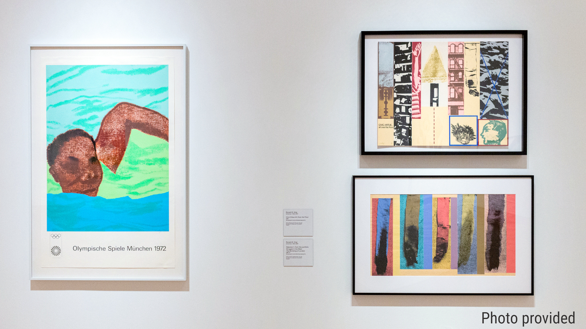
Q: There were 35 official posters for the '72 games (five issues of seven apiece), if I'm reading your essay correctly. How many did you end up including in the show and how did you determine which ones you wanted to include?
Watters: I'd have to count to know exactly how many are in the show. It's between 10 and 15.
There are three in the first gallery. Those three are to put in the context of Germany or the Olympic Committee thinking about 'international' and what the term international means. One is by a Polish artist, one is by a Jewish artist … and one is by a Japanese artist.
The Polish artist was working in Paris, I believe. The Japanese artist had been in New York for more than a decade.
The second gallery was chosen to align with the rest of the collection, to shift the focus and think about putting the poster designs by fine artists in the context of their work across media. All the works in that gallery draw from WCMA's collection.
The museum has a great collection by [Josef] Albers. There are a ton of paintings and prints related to [Albers' Olympic] poster. We pair two of his prints with the posters. Jacob Lawrence, too. It could have gone in another section, but it went in this section.
It wasn't just what WCMA had in its collection, it was what I would consider some of the most important artists. Those two factors together determined which posters were mounted on the wall.
Q: Do you have a favorite?
Watters: I have a couple of favorites.
One by Shusaku Arakawa. I wouldn't recommend using it with your article necessarily because it is so much better in person. The Jacob Lawrence and Jan Lenica are some of my favorites as well.
The Arakawa poster I love because it's unusual for the posters. The background that he uses, the surface is reflective, so when you look at it, there's an image but you're also kind of seeing an image of yourself. He's a conceptual artist, and I find his work really interesting, and I don't normally like conceptual art.
On top of the reflective, mirror-like surface, he pulled out a series of photographs by an artist/scientist named Eadweard Muybridge, who was British. He was interested in trying to answer the question: When a horse runs, does it ever have all four feet off the ground? He developed a system of camera set up 10 feet apart over a race course, and there was a sensor that would determine when a horse was crossing, and the camera would go off. He got images in succession of a horse in motion. He also got a lot of shots of humans in motion using the same method.
Arakawa included a series of a man running.
Q: You discuss in the essay the aesthetic chosen for the postwar games in Rome and Tokyo. Have you done much investigation on your own into how other nations have used the art and messaging associated with the games to promote a national agenda?
Watters: Originally, there was a section of the show on the official posters used through the ages. It was going to include London '48, Mexico City '68, Paris '24, Stockholm '56. You could really see the different countries trying to convey different senses of national identity through posters, and you could see how that changed over time. Cities became less Euro-centric.
It didn't end up in the final show that is installed, but it got me thinking about how the Olympics are this moment of unity for a nation and also for the world in many ways. There is this conveying of national identity and a kind of tension between play and opposition — diplomacy versus competition — that has come into play since the beginning of the modern games and even the ancient games.
I looked at the posters for Los Angeles '84. They didn't have the same political charge that the '72 designs had. I think there wasn't as much at stake for the U.S. in '84. There were Cold War politics coming into those games.
Q: You mention the '84 games, and one thing that stands out from those was the spectacle of the opening ceremonies. I may be mistaken, but it feels like that was the start of a push for more elaborate ceremonies that also push a national identity with heavy messaging — think about Beijing or London or Atlanta. Is it possible that those ceremonies took the place of the posters as messaging vehicles?
Watters: In 1972, it was not just the graphic designs and posters. There were flower pots decorated related to the games. There were music concerts across the city and cultural events and dance performances tied into the games. I know there was a poster advertising an international folk dance festival, and a schedule published that provided attendees information about all the other cultural events going on.
The idea that this is a performance for a country on an international stage goes back.
Q: Leaving aside just for a moment the hostage crisis that became in many ways the defining moment of the '72 Olympics, do you think the posters worked? Did they move the needle at all about perceptions of West Germany in the 1970s?
Watters: I don't feel qualified to say definitively. I think there was a positive effect at the time, pre-attack.
Even now, I was talking to someone the other day who was there, and he said it was unbelievable. It totally changed Munich as a city. It put it on the map as a tourist center, and, in many ways, changed people's perception of Germany. I'm surprised how many people I meet who say, 'I remember those [posters].' Certainly, not everyone does, but it's more than you would expect.
I know they also influenced graphic design as a field.
But the attack — I really think that's one of the reasons the posters are not found in museums. … Another reason is that they're posters, and some are by fine artists and museums are more interested in their other work. But another reason they've been cast aside is because of the attack.
I think the graphic design was conveying a message that was, ultimately, Utopian. There were still issues in West Germany in 1972: civil rights issues, the whole issue with East Germany, you still had the Soviets, and West Germany was right in the middle of that. They were dealing with reparations. There was economic depression in many ways.
They were putting forward a Utopian image. And I don't blame them for that, but I think everyone knew it was not entirely accurate.
Q: But there is something to be said for having aspirations, no?
Watters: Absolutely, Even government officials started putting out new policies. There was a whole new outlook in Germany about how they were going to have diplomatic relations with Poland and East Germany. The games happened at a turning point for German foreign policy.
The games, in many ways, were necessary for them to build momentum. I can see how you have to have aspirations in order to reach your goal.
Tags: Q&A,